
 |
| Layer of background hills |

We left the hills wash to dry then added dry brushstroke trees into a body of wash bleeding into a clear wash below so that it was soft edged at the bottom creating the impression of a tree rising out of river mist.

We alternated washes with this a painting from this photo of a house in Shotesham, I chose this because when we go out painting local scenes it's important to know what makes a good composition, and also it's a dull day shot, and I wanted to illustrate how to make a dull day look interesting by a choice of colours and good composition.
 Here is a painting demonstration I did years ago of a dull day scene, where all the colours were a flat
dull green in real life, but I added a triadic colour combination of yellow green violet and orange red,
 |
| colour harmonies have been worked out by artists over centuries to show us what colours work well together, in the same way vocal harmonies sound beautiful with the right combination. |
 We practiced mixing these colours first with a combination of lemon yellow, pthalo and ultramarine blue, permanent rose and cadmium red, to have a mix which was predominantly green but looking for as many variations of green as we could using all the colours ( without washing our brushes out ) and combining them with variations of violet and purple to separate out the different colour shapes in the picture and to add a complimetarty colour.
Here are some student results which show an ability to paint wet in wet whist keeping surface water consistency, apply pigment at the right water ratio to make sure the pigment only travels in the required area, mix colours both in the palette and on the paper to create an interesting variation of colours, and it shows an understanding of how to use complimentary and triadic colours, we are now beginning to understand and demonstrate how to put ourselves in the driving seat when choosing a subject to paint and the colour choices we want to make, well done yous lot : ) we will continue with this next week.


Here are some other local ( Shotesham ) views which have the potential IMO of making good compositions, we discussed in class how the footpath is a good compositional device to draw the viewer into the picture, and guide the viewer through the picture plane, see the paintings below, and whilst these don't all have obvious footpaths, they have the potential to be added, and also to be removed or re arranged, as in the red telephone box in the photo below, which dominates far too much 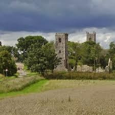


No comments:
Post a Comment