Tuesday 27 March 2018

Teaching notes for Tuesday the 27th of March 2017

This week we were focussing on colour and composition through still life in preparation for learning about landscape composition in the Summer term, with a change of date starting on Tuesday the 240th of April.


In the composition below, were were using the complimenteries of red violet and yellow green, with the intense colours confined to the main objects and the semi neutrals supporting these colours in the background.
Below is the lighted still life used in class.
Below that is the unlighted SL I used for my example.


Below is the example of the washes we would follow for this demonstration, before we started, it was really important we did a tonal thumbnail ( see top right of the painting ) This was so we could plan the scale and placing of the objects within a given frame, rather than starting to draw on a blank piece of paper either too small or too big, or too close to 1 edge, it also, and very importantly, helps us to plan the tonal range needed in order that our focal point stands out, which in the this case was the sprouty green vegetable which needed to be tonally lighter than the rest of the painting, to stand out from the other objects, and create a light background to enable the right hand onion to stand out more.


Below is a simple exercise which demonstrates how to create a focal point using contrast, in this example the contrast is created by the triangle being the lightest object in the painting next to the darkest object, note that the circle is very similar in tone to the background and is grabbing less of your attention by being less contrasting, the square has more 'pull' than the circle by having a gradated opposite.

Here is a simple still life of light out of dark, and there is no doubt about it's focal point
The focal point in this painting is the fruit, however the artist also wants you to rest your eyes on the reflection on the jar, and light shining on the cloth, in this way, you are encouraged to move your eye around the composition.


Another aspect of composition we were studying today was harmony, this is where you have a repetition of similar shapes, colours, texture, lines and direction, however, you still need contrast to keep the painting from looking too similar
Below is a painting which has attempted to have harmony in colour without any variations in the similarity of colour as a result it is boring and lifeless.


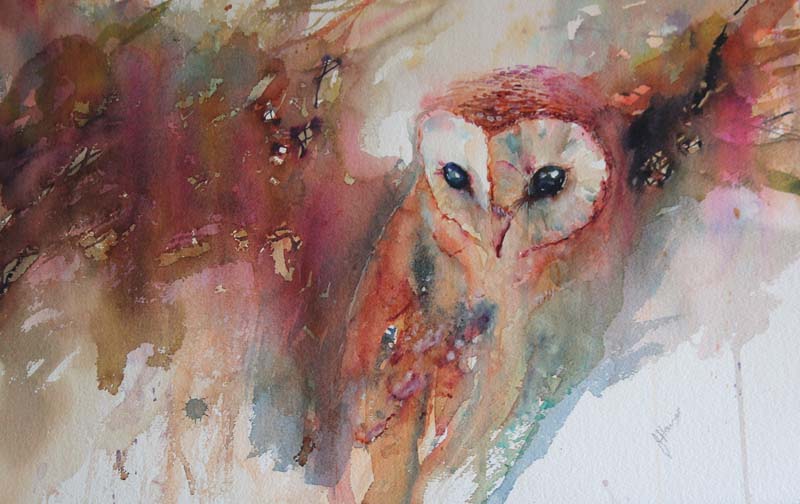
Below are some successful still lifes, have a look and be aware of where your eye is moving over the picture, what is it most drawn to and why, is there a focal point? or more than one? 
Think about the different ways the artist has created contrast to attract your eye, and think about the artists choice of colour, use the colour wheel to figure out what their colour choices were.


Newt week we will continue with your still life, however, I said we'd be working from photographs as the sprouty green veg will have wilted by then, but on reflection, we haven't drawn much detail on that yet, so I'll get another one, and use the onions and beetroot which won't have perished then, when we add detail for still life, we'll be making compositional choices as we can refine where our focal point will be, I will email the photo's of the still life for those to paint up who were unable to come this week.


Tuesday 20 March 2018

TEACHING NOTES FOR TUESDAY THE 20TH MARCH 2018

This week we were finishing off our cockerels, see previous post for ref.
 We were taking the same approach and applying them to painting a subject from life, as we needed to move on from making the choices of another artist, and begin to make our own choices, a good subject for this was flowers as we had started with snowdrops from handouts, but this week we moved on to real life daffodils, as the snowdrops are now over.

Before we started we studied a series of watercolour paintings by various artists using different approaches, both classes particularly liked these white roses by Adisorn Pornsirikarn, we discussed what we liked about it, but most of us shared the emotional response they had, most of us liked the soft light touch of the artist, and then we explored what techniques the artist used to create this, we looked at the 'lost edges' this means areas that are not defined by having a hard edge, see the top left hand side of the top rose = no visible edge, and in fact most of the outside edges are soft on the top rose, even the edges which are hard, have quite a pale background, and therefore appear to be less hard than those with a dark background.
Notice also within the petals there are no outlines, just edges, all these things are achieved by creating an initial 1st wash wet in wet over the whole paper, creating wet in wet soft edges where necessary, leaving it to dry and creating hard and soft edges where required, this means putting a clear wash down, say on a petal, or a piece of background, and only allowing the pigment to travel to one side of that wash, so where it meets the edge of 1 side, it creates a hard edge, and where the pigment doesn't meet the other edge of then clear wash bleeds out softly to clear water.


I love this painting also, but it was less popular with each group, I love the compositional flow of lines towards the stamens, but this painting is made up mostly of hard edges and high definition, and is dramatic due the high level of contrast between dark and light, and also the use of compositional diagonal lines.


We explored paintings which left a lot out, which is useful to know when having a time limit on the painting time, and also to know how to put the 1st washes down.


This is the painting we were using for colour inspiration today, however we decided that we would not have to have a hard edge all around.


Here are some student examples of applying an initial 1st wash to describe the daffodil by applying a clear wash to the whole paper and allowing the pigment to travel beyond the pencil marks once we had drawn up the daffs, we tried to vary the colours of the yellow by exaggerating and inventing some of the colours as you can see in the example above, this makes for a more interesting painting than just copying exactly what we see in front of us.
Once the 1st wash has dried as before, we painted in the negative spaces behind the daffs, to define certain areas of them , by applying a clear wash up to the flower edges and out onto the edges of the paper, and aim to use various colours resulting in a semi neutral including green and purple / mauve, which are beautiful compliments to yellow see colour wheel. 


We discussed how much detail to add to the paintings, and felt some needed a little more definition once the background had been put in, note that not all the edges on the daffs are defined, this was a student choice, made from liking the white rose to begin with.

The stems could be put in wet in wet during the 1st wash, and defined more if needed by keeping them dry during the 2nd wash.


For this who wanted to continue painting the daffs at home, I have emailed photo's to you, but if you weren't in class this week, please work from your own daffs from real life.
I look forwards to seeing you next week which is week 9 of 10.

Tuesday 13 March 2018

Teaching notes for week 7 13th March 2018


Following on from the Jean Haines style snowdrops from last week, we were consolidating and extending what we learned from that, and applying that knowledge and techniques to painting these cockerels.
I decided that at this stage it would be easier to work from some of my own demonstrations than work from a photograph, as the object of this exercise was to get my students to use enough water for wet in wet pigment to blend it's self with the use of pigment flow, and this involved letting go of photographic accuracy and the kind of detail which it would be tempting to include when copying a photograph, however the limitations of working this way is to limit the student in following my own brush mark and colour choices.
This approach is very wet wash orientated.

Just like the snowdrops our first ( under ) wash, was there to represent the lighter areas which go under and beyond the darker areas you can see with hard edges.
So the cockerels head is the 1st light wash left to dry, and is defined by painting in the background around the head to define the edges of the head.
However I took my students too far too fast today, because if you can see the demonstration below left, the head is defined by a negative shape, and the beast feathers are painted in a positive shape, crossing over at the beak, and on the right hand side demonstration, the breast feathers are wet in wet to confuse matters more.
At this stage all I need my students to know, is that the background wash ( negative shape ) can define the main object if it is darker than the main object.


Below is the photo reference we are going to work on next week, but have a look at all the detail in this image, and imagine trying to resist painting each and every detail, I'm not saying it is wrong to do so, but a successful painting has a life of it's own, and is not just a slavish copy of a photograph, we bring something of ourselves to it, and when we edit out a lot of the detail from our reference material we are making decisions about what to leave out, and that choice is different for everybody.

Here are some student exercises done today with this technique and approach, please bear in mind that they are unfinished, and limited by copying my own demonstrations which were not carefully drawn or contained any finished detail, we will work towards that next week.

The student below is now using enough water with her pigment so that the pigments interacts with other pigments on it's travels down the paper and creates beautiful variations, not enough water results in the pigments staying put, which in this case will not result in watercolours self mixing.
This student maintained surface water consistency S W C until the end where the orange ran into dry blue, but in this case it enhances the painting as it's meant to be about texture, and subsequent washes can cover up these areas if necessary.
2nd washes are any hard edged areas within the main wash.


The student below used rock salt for the texture.


The student below is further exploring how to pull pigment out with a feathered brush to create a feather texture.


A half finished demo of mine


This is my demonstration below and above, ( unfinished ) demonstrating how to pull pigment out of the main wash to create feathers, the approach to adopt is keep it simple K I S


A cockerel with the eyes and beak painted in brings the whole painting together, please do this at home everybody, you can use the reference on the cockerel photo I have posted on here


Look at the lovely colours this student has created by allowing pigment flow, the surface of this painting was so wet it was pooling, no bad thing, easier to mop up a pool, than try to push paint around which can't move on it's own through too little water.

This student example below used the negative shape, ( background wash ) to define not only the cockerels head, but pulled this same wash out onto the paper on the other edge to create not only a lovely colour mix through pigment flow, but an interesting shape for the outer edge of this wash.
The 1st wash is everything you can see in peachy pink.


Please have another go at home everybody if you get time, use this approach, it's not easy, there are easier ways to paint in watercolour, but you don't learn as much or get the best results out of your work.
Below are some Jean Haines paintings which are good examples of creating a painting which you can see are far from photographic, notice not all her edges are defined, and she is more concerned with achieving her choice of colour mixes and texture than real life accuracy.
In short, she is, and we are learning to create a painting, and not just copy a photograph.
Image result for jean haines artist cockerelsRelated imageImage result for jean haines artist cockerels


Tuesday 6 March 2018

TEACHING NOTES FOR TUES 6TH MARCH 2018

This week we were consolidating what we learned about pigment flow wet in wet, ( that means working into a clear wash ) from painting the owl last week, see previous post, to painting the duckling, last week the owl was in 1 colour as I wanted you to get used to controlling the pigment flow alone, this week we were repeating the exercise but using 3 colours which is harder, as this takes more time to mix, meaning you have to paint faster before the wash dries.

Also important with using 3 colours, in this case red blue and yellow to make variations of brown neutrals, is that it gives us the opportunity to make our colours more beautiful and interesting by having related colours in 1 picture, this is called harmony. See unfinished duckling below, we were not just pre mixing the 3 colours, but adding a little of one or the other to our unwashed brushes and placing it adjacent to or over the top of other colours on our painting.

Unfinished duckling using red yellow and blue to make variations of brown wet into wet.


We started by colour mixing with our 3 colours to see how many of the lovely variations you can get out of just 3 colours, see above and below. The one above was a student who changed from blue to indigo, and used windsor, ( like pthalo ) blue. instead of ultramarine.
 We alternated painting this with the snowdrop exercise, seen here as a Jean Haines painting.
As with the rook painting ( see previous posts ) where we had to paint within a very particular shape, the snowdrop exercise involves painting around a particular shape by leaving at least 1 petal dry, ensuring 1 white petal, whilst we began with a clear wash over the whole of the paper, and dropping very wet pigment in fairly pale colours around the snowdrop, then applying salt for texture, note that the right hand petals contains the colours from the 1st wash.

We left this wash to develop and dry, before applying another clear wash to small areas around both  snowdrop petals, and applying pigment to selected areas where we wanted contrast and definition, we chose not to necessarily define the whole outside edge of the snowdrop in the intermediates group, who were following a photograph rather than the painting, see below

These are some examples of today's exercise by the intermediates students and myself, we discovered that in this exercise, the pigments that we dropped in needed to be very wet indeed, and we had to let go of the outcome to grater extent than on the duckling, by allowing the pigment to run fast into the other pigments and mixing it's self


Here are 2 paintings I did during the big snow that use a similar technique.
You may want to pick some snowdrops and have another go at home using this technique, your results will be different every time, and if you don't like what you have done draw another one and have another go, you haven't invested too much in the drawing to to get nervous about scrapping it and doing another one, good luck, and I'll see you next week. 😊😊