Wednesday 27 June 2012

Gauging colour and proportions in my wed watercolour class


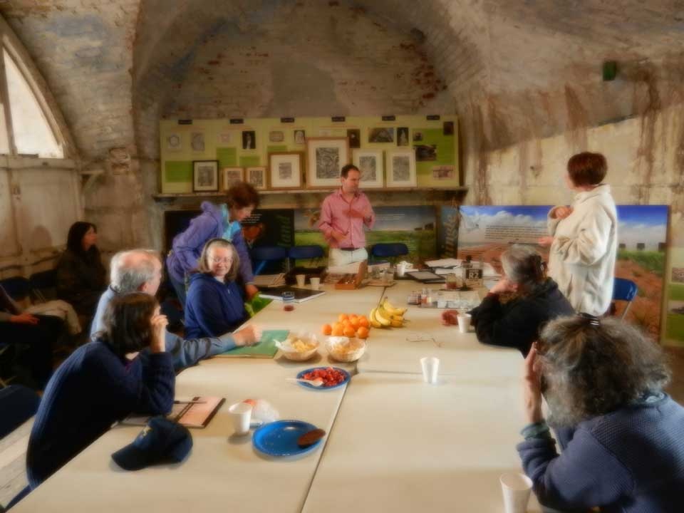
Despite this looking like a dull day today, it was a balmy 23 . C, and hardly a breath of wind, & no direct sunlight, which made for easy painting conditions, and so I had planned to take my wed watercolourists back to Comberton village green to finish last weeks painting of the house on the green, however 1 or 2 had done as much as they wanted to on that, and as I am recovering from being unwell, did not want to teach on the green as this particular spot is very noisy, and it would have taken more energy than I had to make myself heard, so we took a vote on it, and decided to paint the big house by Comberton church, in a lovely secluded field which was very peaceful.


I had decided whichever situation we chose to paint, it would be a good idea to address some drawing issues from last week, as most learners had gone ahead and drawn the doors and windows before they had checked that the proportions of the basic structure was accurate.
So I had them do the same measuring procedure as my drawing class this week, ( see previous blog for details )


this was my drawing class exercise ( below )
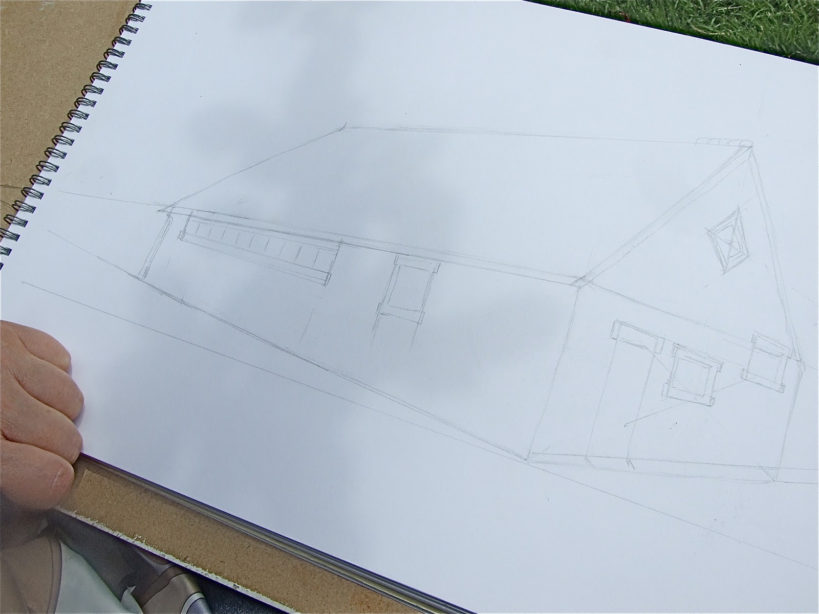
 and last weeks house on the green exercise ( above )


Learners work, above and below


at the end of the class we had a group discussion, to see how we got on with it, and in response to my learners questions about how to proceed with a second or third wash, I showed them some paintings by Juliet Palmer ( below ) to illustrate that the amount of additions to washes once the main values have been blocked in, will be guided by the artist own choice about how detailed they want the final painting to be, and if detail is to be added, it must be born in mind, that overall picture balance of colours and tone is something which must be constantly assessed, my suggestion for doing this was to hold the painting upside down, or to look at it in the mirror, or squint, or sleep on it, ( not literally ), and judge for yourself, where your eye is being pulled, is that the focal point you really want? is it too intense? too dark? too detailed? Re- balance your picture to frame your focal point, or to keep the viewers eye moving where you want it to go.
This beautiful painting by Juliet Palmer ( below ) is absolutely filled with detail, which she has managed to organize so you have 2 subtle focal points of white, center, and center left bottom.

However, try to look beneath the detail, and you will notice basic value washes that would have looked very similar to Ron Ranson's very loose painting of a country lane, ( bottom of the page )  my own first wash on the Comberton mansion, and my learners work today.
I think both of these paintings are delightful as finished paintings, so it's up to you which approach you want to take, but next week we'll be going for the juliet palmer approach, as I want you to choose your style based on an ability to do both competently, and as a progression from basic washes.


Painting by Ron Ranson V


The sun came out for my thursday class. : )


Gauging correct angles and proportions ( Drawing class )

My drawing class on tuesday was designed to measure angles and proportions accurately, and transfer these to paper.
 We started by drawing the boxes inside, by roughly sketching in the boxes without any measuring in order to contain the drawing within it boundaries, and to have something to pin our angles and proportions on.

Then we measured the angles of the box in perspective, by holding our arms straight out between our eye and the angle on the box, and then we slid our drawing pad underneath the pencil to to transfer the angle to be drawn in.

We did not attempt to find and fit the vanishing points on our drawings this week, as this would have made our drawings too small, but we were aware that our angles ought to be converging on an imaginary vanishing point off the edge of the paper.

The proportions were worked out by finding the shortest measurement, the drop on the smallest box, 
( green side ) and calling this measurement 1 unit,  seeing how many times that unit fitted into the length
 ( green side ).

We then adjusted our rough sketch of that part of our drawing, by applying the same proportions that we measured on the box, for example, the length was 3 units long in relation to the 1 unit drop.

Then we measured other parts of the box by measurements of units in relation to the whole.
Other measurements were also used by continually making vertical and horizontal measurements in a continual adjustment, so that the end drawing was all perfectly in proportion, and with correct angles from the viewpoint each of us were sitting.
We then went outside, and drew st Andrews church rooms, applying the same principles as we did inside with the boxes

The windows and doors were not added until basic structure, ie walls and roof, were drawn correctly in proportion and angles.
It helped us to find the correct place for the placing of Doors and windows, by finding the center of each gable wall in perspective, by drawing a diagonal cross from corner to corner, and drawing a vertical line through the center junction, this is the halfway point in perspective.
This junction is not the same as measuring the exact half way between 1 end wall and another, this would only count as the center point, if you were looking at the building straight on.


All the drawings on tuesday were exactly correct in angle and proportion relating to the position each of us was sitting.

 Next week, we will measure tone accurately, and render the surface with detail, perhaps we'll even draw in a bit of the church behind the church rooms? : ) this drawing below is what we might aim for.

Wednesday 20 June 2012

Measuring angles class

Both the drawing and wednesday watercolour classes were out-doors this week due to the nice weather, we measured angles and proportions.
The drawing class at Impington drew st Andrews church, where we meet.

We first drew the vanishing points of the church inside from photocopies, then found them again on an image projected against the wall with the aid of bamboo sticks, then we went outside to draw the church, measuring the angles of the extreme top and bottom parts of the church to find the vanishing points in the church yard, then measuring the proportions of each section in relation to the whole.


The church was a rather complicated building to study, if the weather is good enough next week, we will draw the simpler church meeting room.


I took my Wednesday watercolour class to paint outdoors on Comberton village green


We met in class and measured the angles of these boxes I put together with colours indicating top and side, 
we used bamboo sticks to illustrate how the lines on the edges of the box, which appear to be parallel when viewed from straight on, converge when viewed at an angle.
Then we drew the angles of the boxes by holding a ruler or pencil between our eye and the boxes to gauge the angle of the boxes, then we transferred this angle to our paper, we did not look for the vanishing point, as this would have made the drawing very small.
I will repeat this exercise for my drawing class as I think it would have helped.


We used rulers and pencils to gauge the angles of the house in the same way we did with the boxes in class.
 Then we  roughly and very lightly, sketched out the house from chimney to pond to contain all we wanted to draw, and then we checked our angles as above, and corrected the light lines we had already put down.
We also held a ruler or pencil as vertically as possible to check the negative spaces in order to see the angles better. see below.

 then we measured the vertical distance between ridge of the roof to the guttering, and the guttering to the top of pond wall, and the pond wall to the pond, and we discovered these were very similar in scale, so we marked these proportions out and drew them in with the correct angle.

Similar measurements for the horizontal proportions were done in relation to the whole  i.e.= the distance between the end of the left gable to where the chimney started, ( unit 1 ) went 3 1/2 times into the length and so on.
I know it seems like a lot of palarvar to begin with, but it becomes automatic after a while and much quicker, also this type of measuring is applied to almost any subject, so if you are doing a portrait for example, it's going to really show if your measurements aren't accurate.


Similarly we measured and compared the colour of our painting by holding up a quick swatch of mixed colour between ourselves and the subject to get the best match, which follows on from last weeks lesson in matching colour and tone from half a photocopy.


Finally we had a group meeting to talk about difficulties, and how to solve them, some L's enjoyed the measuring more than the painting and vice versa.
And to sum up, I added that it is not always necessary to paint exactly what is in front of you, but if you choose to be abstract and interpretive, it is because you want to and not because you don't know how to represent the actual.

I think we should have a progression of building layers up to demonstrate the detail that we all like to do for next week.


Workshop I attended on Sunday.....

On Sunday I attended a workshop organized by the Society of east anglian watercolour artist.
The workshop was hosted by Thomas Plunket, who is the president of the Royal watercolour society in London.
The workshop was called what lies beneath, and the theme was to create abstract paintings based on drawings of the building we were working in, which was the fort at Felixtowe.
The idea was to take elements, of the building and abstract it into shapes at the drawing stage by editing what we saw, and adding according to our response to the scene.
This was not easy for me, as I am usually ( always ) representational in my approach.


After the first sketches were done in water soluble ink, they were dipped in a tray of water and the ink was allowed to run down the painting

Here's a cheeky picture drawn by thomas using both hands at the same time, he'd seen me drawing him, and I think this is me, tee hee.

Thomas's other drawings were of the fort itself, after being emmersed in the water,  Thomas applied wax candles and pastels areas for of resist, and watercolours and  white gouache applied over that.
My effort below was following a conversation with T, regarding being creative with shapes and colours, the scene below did not exist in it's entirety, and i found it very liberating to invent and emphasize on the spot, as i normally only do this sort of concept work for roughs before I set up a model or still life.

I believe ones emotional response to the subject at this stage directed where the pigment and wax was placed. This is an area in which I would benefit from further tuition.
The most important thing I took out of the day for me, was that drawing a subject extensively from life adds to the depth of understanding of the subject, and enhances the result from the painting.

Thursday 14 June 2012

This week's watercolour classes

I have translated the Drawing class exercise ( previous post ) to the watercolour classes also.
My watercolour class Learners were faced with the added challenge of measuring tone within colour, and also gauging intense to neutral colours.
The object of this exercise is to equip learners with mixing techiniques to represent a range of tone, intensity and neutrality accurately, and to know how keep each wash relevant to the whole picture.

1st---this is what the learners were aiming for, not a finished painting, but an exercise in translating tone and colour from a photocopy without any detail.
The right hand side was the stuck down photocopy, and the left, painted in simple strips so that the join in the middle would dissapear as much as possible by use of correct colour and tone only.

We started in the same way as the drawing class, by measuring accurate proportions, sticking half the photocopy down, and drawing in the rest.

Measuring proportions

Below is a colour and tone exercise strip, essential for all, but even for more experienced, this is a good warming up exercise.
In this case viridian was gradated from very pale to V. intense, then neutralized at the bottom with burnt umber to lose it's intensity, this is useful when representing the density of foliage in shadow, the greens losing their intensity without sunlight on them.
  neutralizing  a colour works by applying the opposite colour on a colour wheel.

Again I asked my learners to paint the scene upside down so they could concentrate on colour and tone, and not be distracted by detail which might throw them off course.
1/2 hr before the end of the lesson, we had a group discussion to compare notes on how we got on, and how we could best proceed.

When one half was finished, I asked L's to finish the exercise at home, by removing the photocopy from the watercolour paper, and completing the other side to match the one already done.
I'll post the results next week.


Tuesday 12 June 2012


Just before half term I emailed all my learners for feedback on what went well for them in classes, and what areas could do with re visiting, or could do with altering or adding to.
All reply emails are confidential, but one theme cropped up throughout, apart from the mainly positive things, and this was a desire to re -visit basics.
With this in mind, and to accommodate my learners who are confident with basics, I gave my tuesday drawing class this lake-landscape to draw with the object of gauging proportions, and tone.

I chose a mountain range as an easier object than say a face, as it was less important to have it 100% accurate.
My learners started by demonstrating to me their understanding of transferring measurements from photocopy to drawing paper, after a brief reminder.

Then I asked them to cut the photocopy in half, stick 1 half down, and outline the contents of the other side with proportions transferred from it.
Then after they had completed a quick gradation strip from dark to light as a separate warming up exercise, they blocked in the various tones of the lakeland scene to match the half of the photocopy stuck down.
I asked them to carry out this exercise upside down, ( no! Not the learners, the scene! )... so they would not be distracted by readable detail, so they could concentrate on seeing the overall tone