Colour theory
This autumn terms lessons are about about painting with a limited pallet, and carefully choosing which colour we want to dominate as the focal point
This means allowing 1 colour to dominate sometimes as a primary colour, that is a colour which is unmixed with other colours, think of red yellow and blue as primaries, and orange, green and violet as secondaries, which means 2 primaries mixed together to make 1 secondary, and tertiary means a primary mixed with a secondary.
Why does this matter?
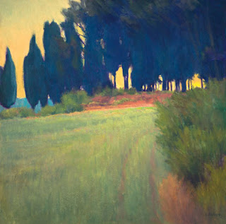
Look at the paintings below, I think these paintings are really beautiful, and because of that I want to know what makes them beautiful, and what I can learn from them in terms of applying the same colour and compositional principles to my own paintings.
Scroll down and see if you can work out what colours were used in each painting.
It may surprise you to know that some of them can be achieved by using only 2 or 3 colours, and that by limiting their pallets these artists have created a beautifully simple colour harmony.
The paintings below are by artists including Anders Zorn, Joaquin Sorolla, Ian Roberts, and Euan Uglow.
You may have noticed that the further down the page you scrolled there was a lessening of the use of Primaries as a focal point, and some of the paintings used secondaries as a focal point, surrounded by tertiaries and beyond to allow the secondaries to shine, or used tone and contrast to draw the eye.
So, the first exercise we did at the beginning of this term was to work out what colours were used in which paintings, and what variations were applied, we came to the conclusion that permanent rose, french ultramarine, and cadmium yellow, were quite adequate for the 2 paintings immediately above, by Sorolla and Zorn.
We started by seeing how many variations on these colours we could find using colour spots, ranging from intense to neutral, and pale to dark, we spent about 1/4 hour doing this, and then my class of 15 people held up their findings to the rest of the class, with whole A3 and A2 sheets full of variations and found no 2 identical, and it was concluded that we could have gone on mixing much longer to get more variations, but as we looked at our results, there was the same very beautiful colour harmony running through them all as a whole.
Above is an Anders Zorn colour pallet, notice how he mixes his intense, and neutral with white to create lighter variations, in watercolour we would simply dilute whatever colour was on our brush to make it paler.
We concluded by painting rough thumbnails of each painting to embed the idea that the same colours can be used to create a new colour bias, and that in using permanent rose we could make an intense red as well as variations on violets mauves and purples, but using cadmium red instead, we could not make vivid purples.
That was last week, this week we will be spending the whole lesson painting up 1 of the above paintings, with a choice of 3.
I do not normally hold with asking learners to do this, preferring instead to allow them to choose their own colours from life, which is what we will be doing the week after, but in this case, I feel it is important to fully understand the subtleties of colour mixing with a limited pallet, before setting them loose in the world of colour.


No comments:
Post a Comment