Tuesday, 20 March 2018

TEACHING NOTES FOR TUESDAY THE 20TH MARCH 2018

This week we were finishing off our cockerels, see previous post for ref.
 We were taking the same approach and applying them to painting a subject from life, as we needed to move on from making the choices of another artist, and begin to make our own choices, a good subject for this was flowers as we had started with snowdrops from handouts, but this week we moved on to real life daffodils, as the snowdrops are now over.

Before we started we studied a series of watercolour paintings by various artists using different approaches, both classes particularly liked these white roses by Adisorn Pornsirikarn, we discussed what we liked about it, but most of us shared the emotional response they had, most of us liked the soft light touch of the artist, and then we explored what techniques the artist used to create this, we looked at the 'lost edges' this means areas that are not defined by having a hard edge, see the top left hand side of the top rose = no visible edge, and in fact most of the outside edges are soft on the top rose, even the edges which are hard, have quite a pale background, and therefore appear to be less hard than those with a dark background.
Notice also within the petals there are no outlines, just edges, all these things are achieved by creating an initial 1st wash wet in wet over the whole paper, creating wet in wet soft edges where necessary, leaving it to dry and creating hard and soft edges where required, this means putting a clear wash down, say on a petal, or a piece of background, and only allowing the pigment to travel to one side of that wash, so where it meets the edge of 1 side, it creates a hard edge, and where the pigment doesn't meet the other edge of then clear wash bleeds out softly to clear water.


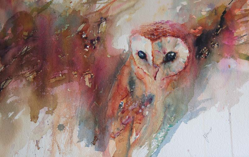
I love this painting also, but it was less popular with each group, I love the compositional flow of lines towards the stamens, but this painting is made up mostly of hard edges and high definition, and is dramatic due the high level of contrast between dark and light, and also the use of compositional diagonal lines.


We explored paintings which left a lot out, which is useful to know when having a time limit on the painting time, and also to know how to put the 1st washes down.


This is the painting we were using for colour inspiration today, however we decided that we would not have to have a hard edge all around.


Here are some student examples of applying an initial 1st wash to describe the daffodil by applying a clear wash to the whole paper and allowing the pigment to travel beyond the pencil marks once we had drawn up the daffs, we tried to vary the colours of the yellow by exaggerating and inventing some of the colours as you can see in the example above, this makes for a more interesting painting than just copying exactly what we see in front of us.
Once the 1st wash has dried as before, we painted in the negative spaces behind the daffs, to define certain areas of them , by applying a clear wash up to the flower edges and out onto the edges of the paper, and aim to use various colours resulting in a semi neutral including green and purple / mauve, which are beautiful compliments to yellow see colour wheel. 


We discussed how much detail to add to the paintings, and felt some needed a little more definition once the background had been put in, note that not all the edges on the daffs are defined, this was a student choice, made from liking the white rose to begin with.

The stems could be put in wet in wet during the 1st wash, and defined more if needed by keeping them dry during the 2nd wash.


For this who wanted to continue painting the daffs at home, I have emailed photo's to you, but if you weren't in class this week, please work from your own daffs from real life.
I look forwards to seeing you next week which is week 9 of 10.

Tuesday, 13 March 2018

Teaching notes for week 7 13th March 2018


Following on from the Jean Haines style snowdrops from last week, we were consolidating and extending what we learned from that, and applying that knowledge and techniques to painting these cockerels.
I decided that at this stage it would be easier to work from some of my own demonstrations than work from a photograph, as the object of this exercise was to get my students to use enough water for wet in wet pigment to blend it's self with the use of pigment flow, and this involved letting go of photographic accuracy and the kind of detail which it would be tempting to include when copying a photograph, however the limitations of working this way is to limit the student in following my own brush mark and colour choices.
This approach is very wet wash orientated.

Just like the snowdrops our first ( under ) wash, was there to represent the lighter areas which go under and beyond the darker areas you can see with hard edges.
So the cockerels head is the 1st light wash left to dry, and is defined by painting in the background around the head to define the edges of the head.
However I took my students too far too fast today, because if you can see the demonstration below left, the head is defined by a negative shape, and the beast feathers are painted in a positive shape, crossing over at the beak, and on the right hand side demonstration, the breast feathers are wet in wet to confuse matters more.
At this stage all I need my students to know, is that the background wash ( negative shape ) can define the main object if it is darker than the main object.


Below is the photo reference we are going to work on next week, but have a look at all the detail in this image, and imagine trying to resist painting each and every detail, I'm not saying it is wrong to do so, but a successful painting has a life of it's own, and is not just a slavish copy of a photograph, we bring something of ourselves to it, and when we edit out a lot of the detail from our reference material we are making decisions about what to leave out, and that choice is different for everybody.

Here are some student exercises done today with this technique and approach, please bear in mind that they are unfinished, and limited by copying my own demonstrations which were not carefully drawn or contained any finished detail, we will work towards that next week.

The student below is now using enough water with her pigment so that the pigments interacts with other pigments on it's travels down the paper and creates beautiful variations, not enough water results in the pigments staying put, which in this case will not result in watercolours self mixing.
This student maintained surface water consistency S W C until the end where the orange ran into dry blue, but in this case it enhances the painting as it's meant to be about texture, and subsequent washes can cover up these areas if necessary.
2nd washes are any hard edged areas within the main wash.


The student below used rock salt for the texture.


The student below is further exploring how to pull pigment out with a feathered brush to create a feather texture.


A half finished demo of mine


This is my demonstration below and above, ( unfinished ) demonstrating how to pull pigment out of the main wash to create feathers, the approach to adopt is keep it simple K I S


A cockerel with the eyes and beak painted in brings the whole painting together, please do this at home everybody, you can use the reference on the cockerel photo I have posted on here


Look at the lovely colours this student has created by allowing pigment flow, the surface of this painting was so wet it was pooling, no bad thing, easier to mop up a pool, than try to push paint around which can't move on it's own through too little water.

This student example below used the negative shape, ( background wash ) to define not only the cockerels head, but pulled this same wash out onto the paper on the other edge to create not only a lovely colour mix through pigment flow, but an interesting shape for the outer edge of this wash.
The 1st wash is everything you can see in peachy pink.


Please have another go at home everybody if you get time, use this approach, it's not easy, there are easier ways to paint in watercolour, but you don't learn as much or get the best results out of your work.
Below are some Jean Haines paintings which are good examples of creating a painting which you can see are far from photographic, notice not all her edges are defined, and she is more concerned with achieving her choice of colour mixes and texture than real life accuracy.
In short, she is, and we are learning to create a painting, and not just copy a photograph.
Image result for jean haines artist cockerelsRelated imageImage result for jean haines artist cockerels


Tuesday, 6 March 2018

TEACHING NOTES FOR TUES 6TH MARCH 2018

This week we were consolidating what we learned about pigment flow wet in wet, ( that means working into a clear wash ) from painting the owl last week, see previous post, to painting the duckling, last week the owl was in 1 colour as I wanted you to get used to controlling the pigment flow alone, this week we were repeating the exercise but using 3 colours which is harder, as this takes more time to mix, meaning you have to paint faster before the wash dries.

Also important with using 3 colours, in this case red blue and yellow to make variations of brown neutrals, is that it gives us the opportunity to make our colours more beautiful and interesting by having related colours in 1 picture, this is called harmony. See unfinished duckling below, we were not just pre mixing the 3 colours, but adding a little of one or the other to our unwashed brushes and placing it adjacent to or over the top of other colours on our painting.

Unfinished duckling using red yellow and blue to make variations of brown wet into wet.


We started by colour mixing with our 3 colours to see how many of the lovely variations you can get out of just 3 colours, see above and below. The one above was a student who changed from blue to indigo, and used windsor, ( like pthalo ) blue. instead of ultramarine.
 We alternated painting this with the snowdrop exercise, seen here as a Jean Haines painting.
As with the rook painting ( see previous posts ) where we had to paint within a very particular shape, the snowdrop exercise involves painting around a particular shape by leaving at least 1 petal dry, ensuring 1 white petal, whilst we began with a clear wash over the whole of the paper, and dropping very wet pigment in fairly pale colours around the snowdrop, then applying salt for texture, note that the right hand petals contains the colours from the 1st wash.

We left this wash to develop and dry, before applying another clear wash to small areas around both  snowdrop petals, and applying pigment to selected areas where we wanted contrast and definition, we chose not to necessarily define the whole outside edge of the snowdrop in the intermediates group, who were following a photograph rather than the painting, see below

These are some examples of today's exercise by the intermediates students and myself, we discovered that in this exercise, the pigments that we dropped in needed to be very wet indeed, and we had to let go of the outcome to grater extent than on the duckling, by allowing the pigment to run fast into the other pigments and mixing it's self


Here are 2 paintings I did during the big snow that use a similar technique.
You may want to pick some snowdrops and have another go at home using this technique, your results will be different every time, and if you don't like what you have done draw another one and have another go, you haven't invested too much in the drawing to to get nervous about scrapping it and doing another one, good luck, and I'll see you next week. 😊😊


Tuesday, 13 February 2018

BEGINNERS AND IMPROVERS CLASS EXERCISES 13TH FEB 2018

For both the beginners and the improvers, this week we were consolidating what we had learned about pigment flow, and how to get big soft washes, and thin lines without leaving pools and floods.
We were also getting used to using enough pigment for dark washes.

Firstly the improvers finished the 2nd boats in mist painting by adding a distant shore line in the mist, but as we wanted it to look like the sun was shining behind the trees we wanted it pink in the middle, and blue at the edges, so we put a clear wash over the whole painting, and painted a line of pale permanent rose above and behind the boats, making sure to keep the brush dry enough so it didn't run too far down the painting, we also went from side to side without hesitating and lifted our brush off the paper at the far edge, to avoid pools forming where we lifted our brush off.
It looks slightly pinky orange on the painting below because the wash on the previous week had yellow on it, without washing our brushes out, we added a little ultramarine blue and painted over the pink leaving a gap in the middle, the repeated that step but applied a slightly darker blue further away from the centre, because the brush had pink on it to begin with, the effect below turned a mauve / purple / blue, then before the wash had dried we added the boats to the left and right with a smaller dryer brush, wet in wet, left the whole thing to dry and added the wet on dry boat in the middle, which is the only thing in the scene which should appear hard edged as it is nearer, and is not softened by mist, but kept pale enough to remain part of the over all tonal balance of the painting.


We wanted to explore how to control pigment flow, with a slightly more difficult subject, firstly we painted these rooks, what makes this harder than the boat in mist scene, is that we are required to paint with different colours within a very specific shape, which takes time, but we didn't want to get lots of un necessary brush marksso we had to keep it wet and surface water consistent, to add to this, we applied table salt to get an interesting texture, and we learned how to pull out the pigment from the main wash to create a feathering effect with a splayed out brush

For a feathering effect, we splayed out our brush and pulled the pigment out into a dry area

 First we practiced with any shape, notice that at the top of this shape there is a hard line between the feathering and the main wash, this is because this part of the wash had dried before we got round to feathering it, we don't want this to happen, so we practiced getting out paint down as quickly as possible with a very few limited broad strokes of phalo blue, permanent rose and indigo, we dropped a sparse amount of table salt on the surface, then feathered it, trying not to carry on too long and fiddle with it, remember SAS painting ; )
We then painted the right hand rook with only pthalo blue, and indigo, then the left hand one adding perm rose. we lifted the eyes out once the whole wash had dried.
The next exercise, whilst appearing simple was quite tricky, I chose this wet in wet baby owl because it would require us to control the pigment flow without the boundaries of the rook, a clear wash was applied to the paper them we had to paint in a pre drawn owl with indigo, balancing the pigment flow between flowing too far ( too wet ) and ending up with brush marks ( too dry ) we practiced this a few times till we got the right consistency, before leaving it to dry then applying the eyes beak and feet wet on dry.
We didn't get round to doing the ducklings but you can have a goo at home if you wish, the bottom one will be harder as there are 3 colours.


Here is the photo ref of the baby owl and ducklings if you want to explore this further.


Finally we moved on to something even trickier with this Koy fish painting, as we needed to try and get the fish tail really skinny whilst getting the body fat with the same brush mark, this involved quite a dry brush and editing our brush marks
 This is my first not very good demo, as you can see I didn't get the tail very skinny, whereas some of you did ; ) some of you also managed to get some of the fish scales on wet in wet high definition.
The fish head could be painted on once the body had dried by wetting the head and body area only with a clear wash, ( keeping the rest of the paper dry ) and applying pigment to the head only, allowing this to flow to a soft bleed into the body, this is also a chance to put in the scales if you didn't manage this in the 1st wash.


Next week is half term, and we will be back the week after that which will be on Tuesday the 27th of Feb 2018, week 10 of spring term finishes on the 27th of march, we may be moving towards painting these cockerels, which is a more advanced version of the rooks you painted today, it is exactly the same technique but with more colours, we will work towards this at your own pace, preparing for each stage with exercises in technique, and starting with simpler subjects.
If you have enjoyed the 1st 5 weeks and feel you would like to continue, and have not already let me know, please do so, and also, as mentioned, I will be running future courses along the south Norfolk school term times, please see the dates below.


I will keep spring term the same as it is, as we have already passed the local half term times, but I have changed the summer term as follows….
SUMMER TERM
17TH APRIL-26th JUNE
HALF TERM ON 29TH MAY
So I have brought the classes forward by 1 week, I know some south Norfolk schools run at different times but these are the dates set out by the council.
I look forwards to teaching those of you who wish to return after half term.
Kind regards
Gilly : )


Thursday, 8 February 2018

NEW WATERCOLOUR CLASS STARTING WED 25TH OF APRIL 2018

THERE WILL BE A NEW WATERCOLOUR CLASS STARTING AT LUNDY GREEN HEMPNALL FROM WEDNESDAY THE 25TH OF APRIL, 10.00A.M.-12.00P.M.
This class is aimed at absolute beginners, and those who have painted a little before, but would like to get to grips with basic application techniques.
Every painting will begin with practicing the technique required for each painting, and is designed to give the student more confidence in achieving the desired effect, and overcoming common stumbling blocks.
The classes are fun, but teaching is structured and sequential, so you will be building on what is learned week by week, through repetition of similar techniques with different subjects.
I ask for an initial 5 week commitment of £75.00 but the douse will run indefinitely.
Please contact Gilly for further information
gill@gilly-marklew.co.uk


Tuesday, 6 February 2018

Beginners and improvers class notes 6th Feb 2018


This week both beginners and improvers worked on the boats in mist painting, each of us had slightly different results, which is as desired, see the difference between my exercise below, and thew original photograph below that, this is my interpretation, however I did restrict you to phalo blue, permanent rose and cadmium yellow and cad red.
The object of today's exercise was to control the amount of water on the brush when applying pigment to get thicker or thinner brush marks as you see in this example.
For the sky and sea we did a 1st wash of pthalo blue top and bottom with a really wet brush on a very wet clear wash all over, then cleaning the brush out, we went in with a small amount of cadmium yellow on the middle, and without cleaning the brush out added a wet bad of permanent rose below the yellow, then we set it aside to dry.


Whilst it was drying, we practiced thick and thin lines again as we have done before, see below, so we could add the banks of colour on either side of the boats, darkening and mixing the colours together as we painted the banks nearest us.
The for the pink hills at the top, we painted a clear wash 2 3rds up the page and applied a pale permanent rose wash into the wet wash and then  up into the dry paper so that we had a hard top edge, and a wet, soft under edge, then added a pink back embankment, then without cleaning our brushes out we added pthalo blue for one  a nearer embankment and added more blue and cad red for the front embankment.
For the boats we used what was on our brushes, and almost totally dried our brushes out to paint the skinny lines needed for our masts.


The improvers went on to paint another boats in mist painting, this time the mass of colour didn't go from the right to the left edge of the painting, but was predominantly yellow / orange to the right and variations of cooler colours to the left, we need extremely wet pigment washes for this to avoid seeing any brush marks for the background.


 As you can see from my demonstration of the 1st wash, 👇👇👇 this can be left open to interpretation, exactly what colours to use.
 Whilst this wash was drying we practiced the band of enbankment / trees across the middle 👆👆👆wet in wet, i'e with a clear wash put down 1st and pigment applied on top of the clear wash.


One thing we all need to consolidate for both classes, is
A. how much water to add to out pigments when mixing a colour in the palette, to create the right amount of pigment flow.
B . How to keep our paintings surface water consistent during the painting process.
Some of us found that the more colours we needed to apply, the longer the process took, and whilst that was happening our painting was drying in some areas and still wet in others.

We will begin to remedy this in the next class, but to sum it up, we need work quickly and finish the painting before we are happy with the result if we see a part of it is drying, although you can extend the drying time by spraying with a fine mist sprayer, or by moving your brush around the painting rather than just working in 1 area at a time.
I showed a painting in progress film at the beginning of this class to demonstrate how the 1st wash can be very simple, and how to add layers once each wash has dried, to build up the effect you want.

Please practice what you have learned at home.