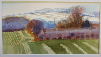
This is my latest painting which groups complex areas by colour shapes, and was constructed to have a strong diagonal composition my emphasising the elements close to the invisible structure lines.
Tuesday, 30 April 2013
Wednesday, 24 April 2013
SIMPLIFYING COLOUR SHAPES
ThiThis term is about simplifying colour shapes, in other words, deciding what to leave out and what to leave in, so that your composition is more easily read visually.The examples below, are paintings I did of Bassingbourn.

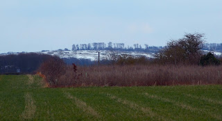
The first stage of the creative process is to see the potential of an otherwise uninspiring scene like the ones below, by finding a scene with strong abstract shapes in it, and add to the colours to make it more interesting
The pictures above and left were the original photographs, and I saturated the colours on my computer to see what they would look like with the shapes distinguished from each other, which emphasised the abstract shapes I had seen the potential in

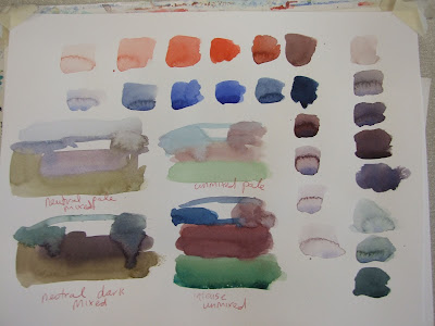
The exercises we did today, were to start by deciding on a colour scheme, see below, we chose to do thumbnails of the colour shapes in neutral dark and light, and intense to pale, we chose our favorite colour scheme before moving on to painting up the finished piece, the object of this exercise was to be disciplined enough, to stick with the colours we had chosen.
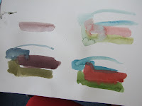
Beginners started by mixing their colours in squares before moving on to thumbnails, the object of this exercise, was to remind ourselves, that neutrals are a mix of complimentary colours ( opposites on the colour wheel ) and intense colours are less mixed with other colours, pale colours can be achieved by watering down what you had on your brush to create the darks and intense.
Beginners also learned not to clean out their pallets, so that they could re use the colours they had already created, and to avoid washing their brush out, unless they wanted a very different colour, to enable them to maintain slight differences in colour and tone from the previous mix still on the brush.


These are a few more ideas I had for paintings with strong colour shapes in

This painting below of violet flowers was requested from my picture presentation from this morning, which is an oil painting by another artist

Monday, 1 April 2013
COME TO THE CAMBRIDGE DRAWING SOCIETY'S
COME TO THE CAMBRIDGE DRAWING SOCIETY'S SPRING EXHIBITION AT THE GUILDHALL CAMBRIDGE.
I'LL BE THERE AT THE PRIVATE VIEW ON FRIDAY 12TH APRIL, AND THE EXHIBITION WILL BE ON TILL SAT 20TH APRIL.
I WILL BE EXHIBITING THE PAINTING BELOW OF WINTER AT THE CAMBRIDGE BOTANICAL GARDENS, AMONGST OTHERS.
HOPE TO SEE YOU THERE!
GILLY XX
Thursday, 21 March 2013
ALL CLASSES WEEK BEGINNING 18TH MARCH 2013
My drawing class were challenged to compare lights and darks in relation to the whole again this week but with a different subject.
This week we had to represent the stones under the water at the bottom end of the tonal scale, Ie all dark, and making sure there was sufficient contrast between them and the stones out of water.


All seemed to enjoy this approach as it was a more relaxed and slower pace, however each brush mark had to count, and therefore carefully considered before economical marks were made
Below are the 1st marks we made, keeping them separate until dry.
The summer term starts back on the week beginning 22nd of april, and we will be continuing this block technique approach, and work towards doing landscapes outdoors, weather permitting.
Thursday, 14 March 2013
2 DIFFERENT APPROACHES TO PORTRAITS
 This week we worked up the portrait we started last week by adding more layers wet in wet of a more warm ochery and sienna type. we were still adding purples and blues but predominantly browns, by adding a clear wash first to get a smooth finish.
We alternated this portrait with another one which we worked up with small blocks of colour wet on dry, after we had created a wet in wet foundation colour.
Our blocks of colour had to be translucent to show the previous colours beneath to form an interesting hemogenous mass of colour


 Here is a sample sheet of glazes built up.
Some of us did a quick exercise in wet in wet in preparation for washes on the smooth portrait.
One learner chose to do a landscape with the same technique as the black man portrait

Monday, 11 March 2013
DRAWING CLASS
Last weeks drawing class was to scale up sheep, identify texture and create tonal contrast relative to the whole picture plane
STILL LIFE WITH STRIPES
I decided to hunt for objects in charity shops that had a relationship with each other in terms of form, tone, colour and subject, rather than trying to cobble things together with the objects I have at home.
I'm also trying to apply some reserve and discipline when it comes to colour!
So I tried 2 secondary complementaries all mixed with cadmium red, cad yellow, and ultramarine, no other colours at all.
The object of all this was to paint a picture I would like to have on my wall at home, rather than have a self indulgent festival of colour.
Subscribe to:
Posts (Atom)


