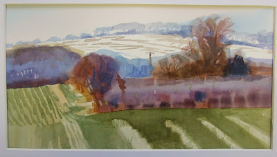
ThiThis term is about simplifying colour shapes, in other words, deciding what to leave out and what to leave in, so that your composition is more easily read visually.The examples below, are paintings I did of Bassingbourn.

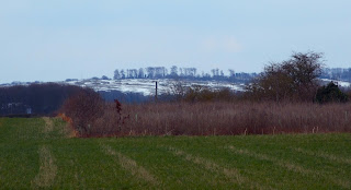
The first stage of the creative process is to see the potential of an otherwise uninspiring scene like the ones below, by finding a scene with strong abstract shapes in it, and add to the colours to make it more interesting
The pictures above and left were the original photographs, and I saturated the colours on my computer to see what they would look like with the shapes distinguished from each other, which emphasised the abstract shapes I had seen the potential in

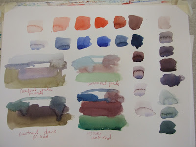
The exercises we did today, were to start by deciding on a colour scheme, see below, we chose to do thumbnails of the colour shapes in neutral dark and light, and intense to pale, we chose our favorite colour scheme before moving on to painting up the finished piece, the object of this exercise was to be disciplined enough, to stick with the colours we had chosen.
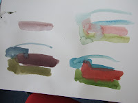
Beginners started by mixing their colours in squares before moving on to thumbnails, the object of this exercise, was to remind ourselves, that neutrals are a mix of complimentary colours ( opposites on the colour wheel ) and intense colours are less mixed with other colours, pale colours can be achieved by watering down what you had on your brush to create the darks and intense.
Beginners also learned not to clean out their pallets, so that they could re use the colours they had already created, and to avoid washing their brush out, unless they wanted a very different colour, to enable them to maintain slight differences in colour and tone from the previous mix still on the brush.


These are a few more ideas I had for paintings with strong colour shapes in

This painting below of violet flowers was requested from my picture presentation from this morning, which is an oil painting by another artist


No comments:
Post a Comment