In wed morn watercolours, we looked over a data projector presentation of all the photo's we took last week posing in our colour co-ordinated clothes, and this week we needed to discuss how to improve on our photo ref to make more effective paintings.
We had a broad consensus of opinion about what colours worked best, and what props were more effective for the flow of the eye around the picture plane.
The we got into the colour groups we were in the previous week, and we picked up the handouts of our group photo, with colour swatches to help us see what colours worked well in comparison to the whole.
I showed some of my examples of the colour variations one could use to apply to the group portrait which weren't on the photo's, and then we got into colour groups and bounced ideas between ourselves about what additions and subtractions worked best
When we were working up our thumbnails we bore in mind that we wanted to highlight some areas of intense colours, to simplify the colour compositin, rather thn having a page full of colours all shouting at the same pitch.
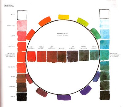
my improvers know how to do this, but I had the beginners do this intensity scale to figure out how to dull down ( neutralize ) some colours, so that the unmixed colours can be more intense in relation to them ( brighter ) and therefore attract the attention more.
The intensity scale below, starts by having 2 unmixed colours on either side of the page, using more pigment, and less water to get a really strong colour, and keep adding a little of the opposite colour the further you get to the middle making the colour incrementally neutral and less intense.
This exercise is best repeated with a washier mix, more water, less pigment, which will be lighter, and attract the eye less, unless it is used in isoltion for a strong island of high contrast, try it out see how it works for you.

Here the 2 Rosemary's are conferring on cropping editing, and colour selection.
more workings out.
Liz cut her handout up, to re arrange them to see what the colours amd elements looked like in different places.
Mel used her mount to guage colours against a different background
Standing back from the thumbnails to see them all together to make comparisons.


No comments:
Post a Comment