This lesson was about what to do with the images we recorded from Cambridge market last week.
We explored cropping and editing our pictures as part of the creative process, and we each brought along printouts of our images for group discussion, what to take out, what to leave in, what to emphasize, or de emphasize.
In cropping our pictures we are limited to what is actually there, and so we went on to draw and paint tonal and colour thumbnail images from our reference to arrange things to better effect, but what does that mean? and what does it involve?
Selection can be a very personal thing, but we discussed as a group what we thought looked better, or worse.
Below are a few of my images which I cropped as an example.....
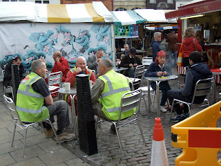
The photograph below, I felt, was really 2 separate images, I thought it was quite amusing to have rufty tufty men with what appears to be chinese wallpaper behind! and I also liked the way the two men in red, only related by their pictorial proximity, were united in the positioning of their hands, and also the man in the grey suit behind him, creating a further diagonal link to bald man.
I also thought that the group on the right, was too much superfluous distraction, but as a colour composition on it's own it had potential, with some re jigging.
I quite liked the image below for it's counter balance of reds and black, but I found a cropped version more compelling and unified, but please feel free to disagree?
The following photo's are cropped for the same reason, let me know if you think my cropping has improved them or what you might have done differently? If you're not sure, view them upside down, so you can look at the colours and the shapes, without being distracted by the subject.
And now ladles and mentalmen! A little journey into taking the creative process a little further, here we have the 3 graces, Mel, Rosemary, and Maureen, note the cropping I did in the image below to cut out a lot of superfluous clutter, ( sorry Liz! and Rosemary 2 )
I liked the way the ladies scarves were a similar colour, and between the scarves, hands and blocks of colour behind them, the attention is drawn from bottom right, in an ark to bottom left, and I liked the way the hair of Mel and Rosemary created a point of high contrast.
Note in the small colour thumbnail ( below ) how I have edited a lot of the crockery out of the picture, so there is just 1 cup forming a counter balance of white against Mel's coat, which I decided should also be white as a focal point, and I also kicked everything else out of the background with a ruthless swash of black, except for the orange and blue patches of colour I thought would be useful to add a further pulling power to Mel's head.
Anyway, this part of the process is great fun to me, although I am aware that beginners want to just get on with the painting without doing this stage, but I do believe that when the time comes to sit down and just paint what is in front of you, your colour composition glasses will be much clearer by having practiced all the above, and the thing you chose to draw or paint will be directed by a finer sense of what looks good, even though you might not be aware that your acquired knowledge is whispering to you!
Next week I will be showing you, beginners in particular, how to mix and apply colours on the paper so you don't end up with streaks or a colour in-balance, and I'll be demonstrating that by adding to the unfinished picture below. In-between then, if you get time, practice doing pencil thumbnails like the one below, about 1 inch sq, to avoid you getting distracted by subject, and focus on shapes and colours.
See y'all next week : )


No comments:
Post a Comment