Tuesday, 5 June 2018

TEACHING NOTES FOR TUESDAY THE 5TH JUNE

it was mooted that this last stage the surface water detail was unnessesary, and I agree, as to leave it blank is to suggest a surface mist, however we had a go as it was useful to understand the technique
This week we were completing our value mass trees silhouetted, by adding swans and a suggestion of the surface of the water, so we did a clear wash in stripes, and added the pigment only in the middle, being careful not to allow it to run to the edges, we then put it to one side to dry before painting in the swans. 


We were also completing our painting of the house in the woods, and exploring in particular what elements of a painting pull our attention, it was useful to look at the tonal squares on the chart ( below the photo ref ) and we were all in agreement as to which squares within each box dominated and why, have a look yourself and see what you think, then look again at the house to understand that the isolation of white in this photograph creates a focal point in its self, look also at the isolation of purple and violet, and the way in which this draws your eye to the house.
We are not always presented with perfect compositions in real life, but by doing these exercises it helps us to firstly see them, then to exaggerate and invent aspect that create good compositions.

Below is an example of the same scene drawn in different ways, the left hand drawing is totally about detail, and has ignored the bigger tonal shapes, and is therefore more difficult to read, think about the right hand drawing in relation to the box shape exercise above to understand how to organise tonal and colour shapes in a composition as opposed to only looking at the detail.Image result for lesley munroe artist norwichHere are 2 paintings by an artist some of us know and love, Lesley Munroe from the Shotesham art group, you can see very clearly in her paintings how she has organised her colour shapes, and makes good use of isolating blocks of white and complimentary colours with the occasional small amour of intense paint.Image result for lesley munroe artist norwich

we can see clearly as the painting progresses and we add pigment to each part of the painting, that this changes the overall balance, an isolation of red on the roof may dominate too much
windows and doors that are too dark may create too much of a focal point by virtue of them being an isolated area of detail  in themselves, whereat a tree with no house will attract too much attention, you don't need a degree in art to see where your eye is drawn to, but it helps to know that to bring something forward you must =create goal or colour contrast, or to make something recede do the opposite and place a colour or tone next to it which is very similar, otherwise take colour or tone out.
Ask yourself how much detail you need to add to your painting, there is no right or wrong answer to this, but remember that detail will attract attention, so it's perfectly acceptable to put detail in one area and leave the rest loose, the trees around the house for example could be worked up more, but best left high definition wet in wet in my opinion.
I am hoping to get you to work from direct observation at some stage so if the weather is clement enough next week this may be the time.
I look forwards to seeing you next week, and if you were unable to attend class this week, please try to keep up  from these notes, as each class is sequential and consecutive, and we are building on skills acquired from the previous week.

Friday, 1 June 2018

TEACHING NOTES FOR THE FRIDAY 1ST OF JUNE WORKSHOP

This months workshop is taking the principles of last months workshop, ( scroll down to May 4th wkshop ) and extending it to encompass background colours to compliment the colours in the painting, and in particular, isolating a colour group for a focal point.


I was inspired by the working methods of this artist, note how she has isolated colours and tonal values to create areas of focal point by means of contrast.


Look at the colour groupings on this colour wheel, notice how everything between the violets and yellow green appear cohesive, similarly everything between pink and yellow, we can use this colour wheel to understand colour groups and apply them to the choices we make when selecting and representing a subject.

We also looked at tonal values, and how to use that to draw your attention to a particular part of the composition, look again at these squares, and see which grab your attention most, and try to anayse why, see ( right ) how to apply tonal values to the same scene to create different focal points and abstract shapes.


My painting ws a quick working out, but you can take this idea, and apply it to anything and develop it.
We began by taking this concept of creating focal points with boxes, and applied the colour to these boxes that we would be using in the final painting, this is a very useful exercise to see whether the final colour balance will be effective, i.e is our eye directed to where we want the viewer to look, can you see the correlation between the abstract and the finished painting? Can you see that the intention was for the pink flowers were meant to be the focal point but we still wanted the white flowers to carry some pulling weight, as well as the isolated green square, the overall intuition was to keep the viewers aye moving around the picture plane, but with a definite focal point of the pink flowers, look again at the artist I was inspired by, and despite all her different colour choices and her tonal balance, she has achieved this in every painting
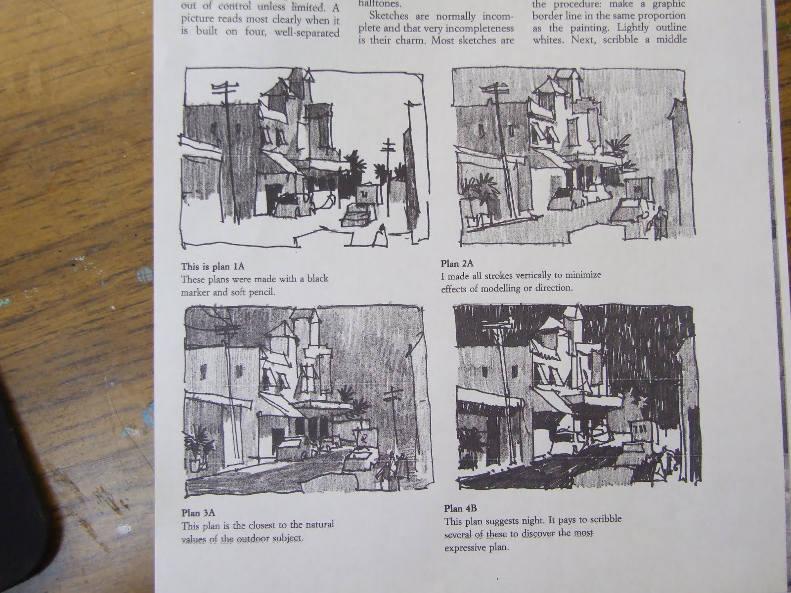
working your colours out with thumbnail sketches really pays dividends, as planning a painting involves a more lengthy process than we have time for during our washes
Here are some student examples of today's practice

The only male student today, preferred boats as a subject, and took the same idea, and applied these principles to this subject, he extended the lines in the subject to cover the background, went beyond my own colour choices and produced this brilliant piece of work, which shows a high degree of creativity and sophistication, quite astonishing considering he is colour blind!here are some photo ref of the flowers we were painting, plus a wet in wet demonstration I gave to show a different approach to washes with flowers

Wednesday, 23 May 2018

TEACHING NOTES FOR WED 23RD OF MAY 2018


As this class was a repeat of the previous class, please refer to teaching notes for ………….

TEACHING NOTES FOR BEGINNERS WED 16TH MAY


What we did differently in this class was to add the boats, by applying a large margin of clear wash beneath the boat, then mixing pthalo blue and cadmium red apply that in a fairly pale wash onto the boat including the figure at the same time so there wasn't a line between him and the boat, indicating that he was silhouetted in the mist and therefore no definition within the wash.
For those who were not here last week keep practicing high and low definition, ( fat and thin lines ) you can do this by drying your brush down, good luck, and I'll see you in 2 weeks time.

Tuesday, 22 May 2018

TEACHING NOTES FOR TUES 22 MAY

This week we were continuing with our misty river and house scene, the object to control pigment flow, and along the way to understand about making choices concerning tonal value, see colour wheel
In this colour wheel we can see that the tonal value ( grey and black segment ) relate to the tonal value of each colour, in that they don't appear lighter or darker than the colour adjacent to them.
We had a choice whether to make our trees as black as the ones in this photo, remember we are creating a painting and not always making an exact copy of what is in front of us
On this colour wheel the tonal grade does not relate to the colour adjacent to it, it is important to understand the tonal value of each colour, so that we can start to understand about keeping our paintings in a similar colour or tonal range to avoid over dramatising them
here are my own colour choices and below student exercises


We alternated between the river and the house scene, building the layers up with a wet wash and a very dry brush to control the pigment flow for high definition trees, we gained in confidence learning how controllable this medium is.
I showed a painting in progress film to show how many layers of paint you can add to build up to a finished painting, we will continue with this after half term
Add caption