Tuesday, 15 May 2018

TEACHING NOTES FOR TUES THE 15TH OF MAY

Layer of background hills
This week we were continuing with our misty river scene and we added a layer of hills in the background by practicing a hard and soft edge exercise, basically by keeping the pigment away from the bottom of a clear wash, and adding pigment close to and beyond the otter edge, so that the top edge of the mountain range was pushed into the dry paper.

We left the hills wash to dry then added dry brushstroke trees into a body of wash bleeding into a clear wash below so that it was soft edged at the bottom creating the impression of a tree rising out of river mist.


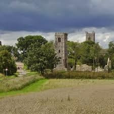
We alternated washes with this a painting from this photo of a house in Shotesham, I chose this because  when we go out painting local scenes it's important to know what makes a good composition, and also it's a dull day shot, and I wanted to illustrate how to make a dull day look interesting by a choice of colours and good composition.

Here is a painting demonstration I did years ago of a dull day scene, where all the colours were a flat
dull green in real life, but I added a triadic colour combination of yellow green violet and orange red,
colour harmonies have been worked out by artists over centuries to show us what colours work well together, in the same way vocal harmonies sound beautiful with the right combination.
We practiced mixing these colours first with a combination of lemon yellow, pthalo and ultramarine blue, permanent rose and cadmium red, to have a mix which was predominantly green but looking for as many variations of green as we could using all the colours ( without washing our brushes out ) and combining them with variations of violet and purple to separate out the different colour shapes in the picture and to add a complimetarty colour. 

Here are some student results which show an ability to paint wet in wet whist keeping surface water consistency, apply pigment at the right water ratio to make sure the pigment only travels in the required area, mix colours both in the palette and on the paper to create an interesting variation of colours, and it shows an understanding of how to use complimentary and triadic colours, we are now beginning to understand and demonstrate how to put ourselves in the driving seat when choosing a subject to paint and the colour choices we want to make, well done yous lot : ) we will continue with this next week.

Here are some other local ( Shotesham ) views which have the potential IMO of making good compositions, we discussed in class how the footpath is a good compositional device to draw the viewer into the picture, and guide the viewer through the picture plane, see the paintings below, and whilst these don't all have obvious footpaths, they have the potential to be added, and also to be removed or re arranged, as in the red telephone box in the photo below, which dominates far too much 

Leading the eye down the road towards a focal point


Tuesday, 8 May 2018

Tuesday the 8th May 2018 teaching notes

here is my finished big tree again.
This week we didn't continue with the big tree, I thought it was best for us to return to understanding value mass wet on dry, which is what we did for the smaller tree, when we understand that wet on dry, we can then do it more easily wet in wet, which is harder, because we have to control big colour shapes  from running into each other.

We started by identifying the big colour and tone shapes  by doing an initial 1st wash of flat green without any brush marks but with a variation of colour and dry brushstroke edges, leaving it to dry, and blocking in the darker tonal masses ( shadow in this case ) in the same way


And added smaller colour shapes, but in my case I kept the smaller colour and tone shapes lighter so they wouldn't interfere with the simplification of the big colour and tone shapes
We alternated the tree washes by beginning this painting which is a simpler way of unifying value mass, as the trees are all backlit, and the only thing which defines them as trees are the shapes their edges make


The main thing we needed to remember during this wash was surface water consistency throughout the painting time, and to remember to dry our pigment to water ratio down when we wanted our pigment to stay put, which we needed for the purple bits. Above are 2 demonstrations of the same scene, see how different they are, but I'm happier with the 1st one, please add another layer if you are not happy with the 1st.
We drew up our painting and applied the 1st washes wet in wet ignoring the trees, as these are hard edges which is not possible to do wet in wet.
We will continue with these washes wet in wet on dry next week, but in the meantime, please practice your application techniques

4TH MAY 2018 ALL DAY WORKSHOP==SEMI ABSTRACTION

my finished piece on the day
In this workshop we were looking at semi abstraction, that is, taking a representional view of a subject and represent abstracting the shapes within to extend into the background, this can be taken further by breaking down shapes within the subject, there will some examples of this later in this post
the example pre painted we are using on the day

First here is a breakdown of the building up process of this painting and these are the viewpoints from the artists angel


Here are some student nearly completed pieces


Here are some examples of semi abstracted paintings


Wednesday, 2 May 2018

BEGINNERS TEACHING NOTES 2ND MAY 2018 and 9th May


This week in beginners we started to add pigment to our mountains, we explored why it is important to be able to use pale and intense / dark paint applications in paintings, see the painting below, it has both pale and dark within it, so we have chosen to do a painting with mountain ranges in it which are pale in the background and get increasingly darker towards the foreground.


We explored how to add more pigment to flat washes by doing squares of washes ranging from pale to dark by adding more pigment to each wash.

 Then we explored how to mix 3 colours together to get increasingly more neutral, the reason for this exercise is to demonstrate what happens when we push the paint around the paper as opposed to allowing the pigment to mix itself and to note these effects, one is not right and another wrong, but we just need to know how to get the effect we are after, column 1 was not pushing the paints together at all, and the result was a mix of mostly pure colour mixing on it's own giving a fresher feel, the more we pushed the pigment around, the more neutral it became ( muddy ), the steet scene above is an example of colours which have bee partially mixed in the pallet, but have been mostly allowed to mix themselves on the paper.

Some artists pre mix all their colours in the pallet, I choose not to for the above reasons, and also because I want to control the pigment to water ratio of each wash, which allows me to make sure the paint doesn't travel too far on the paper if I go in with a dryer brush, if that is required, which is impossible if the paint is pre mixed to a particular consistency.

After we had done the % mixing exercise some of our neutrals were on the yellow or red or blue spectrum, we used this to our advantage when we came to paint the 2nd line of hills by adding more of 1 pigment in relation to the other.


We painted the most distant hills first with a pale blue, making sure to paint a clear wash 1st and continue this a long way down the painting, some of found that their clear wash didn't go far enough down the painting and their pigment hit the dry paper causing a water mark which would be visible in consequent washes.

After the furthest hills had dried, we painted the 2nd furthest hills slightly darker blue with a hint of yellow, to neutralise the blue and give it a lightly greenish tinge, making sure to avoid hard edges underneath by having a deep enough clear wash.

This week, we added consecutive layers over the top of the previous washes getting incrementally darker, and making each layer slightly greener by adding a little more yellow.

We made sure to start with a clear wash from the top of the hills to the bottom line with each hill wash, to avoid a hard line forming too high up the painting, then being visible through the translucent wash of the next set of hills, we discovered that the pigment in our previous wash didn't move as it had dried and adhered to the paper.

Note a little trick on my demonstration, I left a pool of pigment at the bottom, and you can see a back run which is formed by the pigment being sucked uphill by the dryer pigment, this is something usually to be avoided, but on this occasion it can suggest vegetation of foliage.
Please bring this with you next week. : )


Tuesday, 1 May 2018

TEACHING NOTES FOR TUESDAY THE 1ST OF MAY

Today we were painting 2 trees in the dry brushstroke style also looking at a compositional fulcrum, in this case a big and a small tree to balance out the compositionsee previous notes, and this time also adding more colour, we were working on the tree on the right and applying the same value mass principles to this as we did last week


We started by mixing others colours to end up with a predominant green but mixed mostly yellows and blues with other colours, here are some student examples


๐Ÿ‘†
The 1st washes of the big tree should look roughly like the one above, clearly mapping out the big colour and tone shapes, here is the original photo again, see if you can see the big shapes..On this demonstration I did more detail to show how it can be added later๐Ÿ‘‡

Whilst it is important to be able to recognise and represent value mass, we may simplify the process next week, as it's a lot of information to take on board in 1 go.