Wednesday, 25 April 2018

25th of april BE25TH OF APRIL BEGINNER WATERCOLOUR CLASS EXERCISES


25th of april BEGINNER WATERCOLOUR CLASS EXERCISES

The first week's watercolour class for beginners  started with a pigment to water ratio series of blobs, ranging from pale to intense ( bright and in this case dark ), in equal increments, the object of this exercise is to know how much pigment to use in relation to water to get the desired intensity onto the paper, it's not always easy to get the ratio correct, see the painting of the dog below, the colours in this painting are intense ( bright )
The colours in this painting below are mostly pale neutral, and would require less pigment on the brush.
The first video is a demonstration of pigment to water ratio blobs.


Remember, the sequence goes like this, water pigment palette paper, then pigment palette paper, unlkess you need to add a little more water to keep your blobs streak free, and always mix your pigment in a small area and separately in the palette each time, this is to avoid picking up more water from a previous mix, and always mix your colours in a small area so you are not depositing more pigment on the palette than necessary. If your pigment are fresh from the tube they will be wet, so you must add tiny amounts to build up the intensity ( brightness gradually with each blob, if you have a blob that has gone too dark / intense too quickly, then clean your brush out, dry it a little on some kitchen roll, and manoeuvre your brush over the blob to lift out the excess pigment and start again.


The next exercise was to paint a colour wheel, 
The value of painting a colour wheel is firstly to consolidate what you know about pigment to water ratio, as I want you to paint all the 12 segments at medium intensity, and practice your application to avoid streaks, ( see a previous video on wash application ) but also this will teach you about colour mixing, so you can understand what colours are intense ( bright ) and what colours are neutral ( dull )see above. This colour wheel was designed by artists to help you understand which colours look good together, have another look at the painting of the dog, these colours are pleasing to the eye because they have been chosen carefully, the colour wheel can help you to achieve this, but again, more on that later.

So, start by drawing a circle and dividing into 12 segments, this is made easier if you draw a cross through the centre, and draw a V shape inside each quarter, so that you have 3 segments in each quarter, please write the terminology next to each segment, where it says primary, secondary and tertiary, primary colours are unmixed with other colours, so we will use cadmium red, cadmium yellow, and ultramarine blue, start by painting in primary red, remember pigment palette paper, so we can see how intense the colour is in the palette before applying to the paper, clean your brush out and paint in your primary yellow, don't wash this yellow off your brush, but use it to pick up some of the red pigment in your palette to create an orange in the secondary segment, you are aiming at creating an orange that looks exactly half way between the red and the yellow, don't clean your brush out, use the orange on your brush to paint in the tertiary sections next to the red and yellow, you are aiming at creating a red orange, and a yellow orange, again, try to make them look half way between their neighbours, do this by eye on your painting, and don't try to duplicate the colours on the image below.
Repeat this exercise creating greens and violets, however, you will find that using a combination of cadmium red and ultramarine will result in burgundy rather than the violet colours you see below. 
( if you want violets you must use a crimson, or pink pigment instead of Cad red )


Angliato see a video demonstration of how to paint a colour wheel, click on this link it is on Facebook watercolour classes in East 


Tuesday, 24 April 2018

week 1 Summer term 24th of April 2018 improvers

We begin this term by exploring composition in landscape, as some of us go out and paint on location and I thought it would be useful to address questions of what do I paint, how do I paint it, and how much can I paint in the time we have allocated.
We are continuing to tackle application in watercolour but with the aforementioned as a theme to work with.
First we looked at some simple armatures, = ( these are the structures that hold a composition together )
for example the group of trees top left is an example of a fulcrum armature, fulcrum meaning weighing scales, note that the group of trees on the right hand side are larger, and have more visual pulling power than the smaller tree on the left, the smaller tree is present to counter balance the pulling weight of the big clump of trees, without it the composition would be weighted too much on the right, but a clump of trees on the left of equal size would create a static and prosaic painting, it is thought amongst artists that this imbalance of weight creates dynamism and interest in a painting, we will be moving on to the is theme in week 2.
This is from a book called mastering composition by Ian Roberts, and it is my composition bible : )


All this was to outline where this summer term is headed, but today, we started by exploring different ways of representing trees, as we need to know how to paint trees if we are going to paint landscapes.

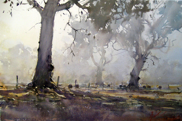
Here are 3 paintings by David Curtis, note that he only has high definition in certain areas, everything else is loosely described with a beautiful mix of colours and suggestion, a form of visual poetry rather than visual prose, these are not botanical paintings of trees


This painting below by Joseph Zbukvic has a similar way of suggesting trees but this is even more minimal, allowing the detail and contrast of this group of painters to be the lead singer, and the background to be the backing group, this kind of simplification is called value massing, that means tying a multitude of complex visual information together in 1 mass of colour and tone.
The 2 paintings below that are characterised again by the lack of detail on the foliage by painting them either wet in wet or by dry brushstroke

this painting below also owes it's etherial quality to the lack of detail and it's focus on light and minimal suggestion, it is stunningly beautiful and evocative of a gentle stillness.
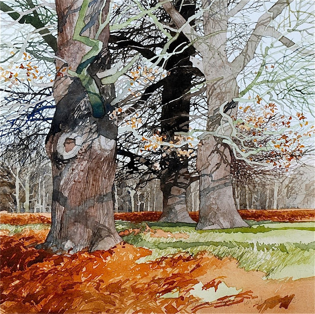
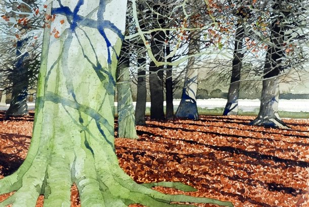
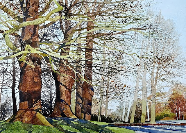
These next paintings in my opinion is equally beautiful, by Ian sideaway, there is a great deal of detail and realistic representation here and beautifully observed, but it is unlikely that we would be able to achieve this amount of detail by a short outdoor painting trip, called painting 'en plain air' I love these painting for their strong abstract shapes which he achieves by using strong sunlight, a limited pallet and knowing where to crop the painting / view

So we have to decide what we can achieve in a short space of time for our ability level, and we settle on a simple dry brushstroke grew by Ron Ranson, the reason I chose this was because in simplifying the value mass of foliage it makes it very quick to paint, but because the edges are broken up are suggestive of foliage.
We began by practicing 'dry' brushstroke on rough watercolour paper, I used st cuthberts mill Bockingford  300gm rough wc paper.
Using dry brush stroke doesn't literally mean dry, but we use a dryer brush than normal, coat the whole length of the brush with pigment, and apply this to the paper at an extremely shallow angle, so much so, the metal part is almost touching the paper, where this went wrong, was using too much water, too steep an angle and pressing down too hard or dabbing, the brush needs to be smoothed over the paper, so that you are almost tickling it, the idea being, that your brush only comes into contact with the rough surface of the paper, leaving the textured lower parts untouched.
However, if you see in the example above, we filled in the centre of the foliage washes by pressing harder, and broke the edges up with a much lighter touch.


A quick tree for field work

The photographic reference we used
It is easier to see the areas of value mass when we convert an image to black and white and outline the  areas of light and shade, this helps us to speed up a painting effectively by initially ignoring the detail
once you have established your large colour and tone shapes ( value mass ) you can choose to keep your painting as simple as that, or you can continue to add detail with the confidence that any detail you add has to remain within the tonal value of each area of value mass, i.e shadow = light and dark at the bottom of the tonal scale, and lighted areas= light and dark within the top end of the tonal scale.this is how the painting below would have evolved, note that despite the mass of detail, you have not lost sight of the bigger tonal shapes of the tree.
The trees below are my demonstrations, we used lemon yellow and indigo to keep these washes as uncomplicated as possible whilst we got to grips with the dry brushstroke technique

For my own simple tree paintings I use a variety of colours and textures once I have established the areas of value mass, see above


Next week we will be practicing the same technique, but we will begin to get to grips with the fulcrum armature of composition.

Friday, 6 April 2018

Watercolour 1 day workshop Friday the 6th of April 2018

This workshop was aimed at suggestion and simplification of value mass, that is to say, we were painting the colour and tonal shapes, which in this case was the shape of the shadows rather than painting all of the interior of the sabastopol goose.
The object of this approach was to create visual poetry rather than prose, that is not describing every detail, and leaving the viewer to fill in the gaps.


We did 2 paintings today, not all completed, but the object was to copy my own example below to start with, to try to consolidate what we knew about value mass, then by working from a photograph on the 2nd goose to work out our own value mass.
we started this by


We started by working on a thumbnail sketch, and blocking in the shadow tonal shapes…the value mass👆
Once we had clearly identified the areas we were going to paint, we had a practice at very quick washes that were not overworked, as this image required a fresh crisp approach.

This is the actual photograph of the goose, there is a lot of detail in here, and it would be very easy to try to do all the detail, which is not wrong, but for this approach..poetry not prose
It's easier to see the simple areas of value mass when you reduce your image to black and white, bump up the contrast and darken it down

To paint the larger areas in shadow all in 1 wash, we didn't need to work quickly to keep this complex area surface water consistent, we just made sure to keep wetting every area that looked like it was drying, either with water or pigment, but a clear wash was first required within the mass area.

The 2nd goose was painted with safety wheels off! This was a chance for the students to demonstrate they had been listening, and I was very pleased that they did, they repeated the whole process, but this time making their own decisions about what to include and what to eliminate, this wasn't easy, and it helped to have the black and white version at hand


The above are some results from todays workshop, which are not all completed, but the students could take their reference home, and with these notes complete them at home and have another go
Some students said they would like to have put more detail on their geese, so I added a few more details to my demonstration today👆and of course it is possible to continue adding layers of detail wet in wet, to wet on dry once one layer has completely dried,

This workshop was for mixed ability, and an improver level student did this same exercise, but with a daffodil instead, like a previous class in Lundy Green.


I wish my students luck with this at home, and look forwards to to teaching the next workshop on Friday the 4th of May 2018

Tuesday, 3 April 2018

TEACHING NOTES FOR TUESDAY THE 3RD OF APRIL 2018


I'm very sorry everybody, but my camera is refusing to up/download any of the photo's of today's demonstration, and student work, but in short, we were adding detail to the negative spaces, whilst darkening down our still life and creating focal points by increasing areas of contrast between light and dark / and different colours
This example below shows a green wash for the foliage, and the leaves were picked out by painting in the dark spaces behind = negative shapes


Here is our still life for this week


We started out with simple foundation washes


And built up the detail by painting in the negative shapes.

This is my ( unfinished ) demonstration which I managed to scan, showing the negative space painting.


Here are some unfinished student paintings, note the tonal thumbnail sketches top right of each painting, this was to compose the objects within a frame, and pin down the tonal value of each object in relation to it's background, which makes for a better overall compositional balance.


look at the foliage on the cabbage below, this is a watercolour using the same technique at the tomato painting, top, we were using this technique to paint the foliage on the green sprouty veg, above.


Both classes started with a colour mixing exercise, with the beginners discovering what a wide range of  of colours can be mixed by using 2 colours together, this gives us much more interesting greens, blues, pinks etc, and what colours to mix with which to get the colour you want, this is a much more interesting approach than painting onions in 1 red colour straight from the tube. ( the last colour is cadmium yellow by the way, I forgot to add the name. )
Both classes mixed all 6 colours together in a star shape by painting an asterix in a clear wash, putting a vey wet blob of each colour at outside edges, allow them to run into each other, then add extra pigment of 1st cad red, and perm rose, then with a free bias using more blue and yellow, then a blue bias using more blue.
I hope you will agree that the mixes in these star shapes are more interesting and beautiful that colours unmixed, or pre mixed in the pallet, when we allow the pigments to mix themselves on the paper without pushing them around too much, they do the most beautiful things.

The  paintings below have a subtle variety of different colours in them despite you being in no doubt what colour the original objects are, and in fact when you look at most objects you should be able to see some variation in colour depending on reflected light, and it's up to us as artists to exaggerate these colours and even invent them at times.
figs in bowlpoppy balser artist - Google SearchJoanne Boon Thomas WATERCOLOR

 these 2 below are crude, boring and not carefully observed.


Summer term will begin on Tuesday the 24th of april